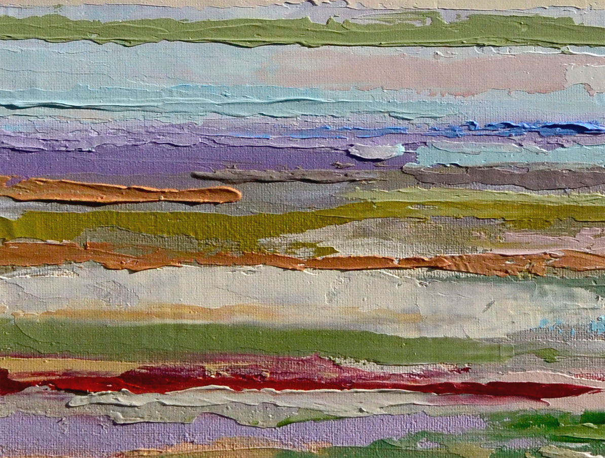
I am an oil painter living in S.E. Pennsylvania. Thanks for stopping by!
Showing posts with label abstract. Show all posts

Saturday, August 15, 2020

Day 14 of the 30 in 30 - Hang in There

 Of course I love the tiger ...and the balloon, but this painting is equally about the background.  I like to experiment balancing subject with background. I find myself sometimes with such a strong subject (remember the bunny on the soup can?) and then am stuck not being quite sure how to approach the background.  Ah well.  This is another attempt at something different.  I wanted to stay neutral with just that pop of red and orange and play with the concept of abstraction meets realism.

Anyway..have you ever seen the inspirational poster of a kitten hanging onto a branch that says "hang in there"?  That's what went through my mind when I was thinking of a title :)  

Hang in there everyone. :)  
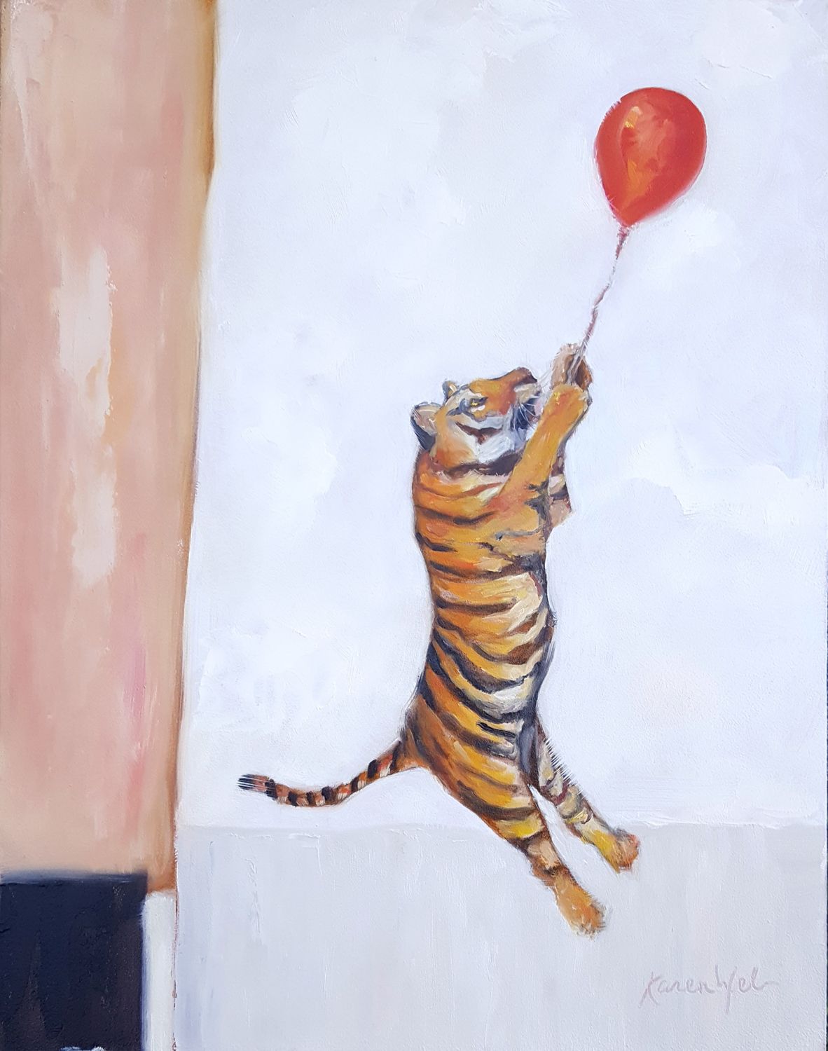


Hang in There, oil, 11"x14", to Click here to purchase


Detail of "Hang in There" 

Saturday, September 10, 2016

Day 10 - The Shark

1/3 of the way through this challenge and for me, its been the best one yet.  This is the fifth one I've participated in and I learn so much from each one.  In this one, I feel like I am taking a workshop every day with all I am discovering.
Some paintings are easier than others to complete.  The whys are varied and include things like humidity, my frame of mind, my connection with the subject and how well I have planned.  This painting was a bear to finish, and the odd thing was that I thought it was going to be a snap!  After fighting with it for a few hours, I determined that the issue was mainly the dryness of the air in my studio.  When the air is too dry, I find the paint to be very uncooperative and it doesn't move around as well as I'd like.  So, all in all, I like the composition and I enjoyed abstracting the background. If I were to do it again, I'd paint it bigger, and make sure there was enough medium on the board to help keep the paint flowing as I like.  This is from a picture I took years ago at the fire house bar I used to cook at.  There was almost always a pool game going on and this guy didn't mind me snapping a few of him playing.

The Shark, oil, 6"x10",
to purchase, please click here

Monday, January 25, 2016

Days 24 and 25 - "Cad Red" and "Vintage Thunderbird"

I just couldn't make it to my studio yesterday due to the immense amount of snow that I had to help deal with in my area of the world.  But, I made up for it today and painted 2 paintings!  The first one is in response to the last one I did, "Utrect Blue".  This one is titled "Cad. Red." Just look how that thin line of Cadmium red is screaming when it is juxtaposed next to Utrect Blue!


Cad Red, acrylic on panel, 4"x4"
to purchase, please click here

This Vintage Thunderbird is today's entry in the 30 in 30.. I was lovin how the red played off of the 2 different blues (ultramarine blue and this funky blue I have called "Utrect" blue) in my previous two little stripeys and decided to play with those colors using a representational subject...
Vintage cars are a theme I return to from time to time as I love their lines, shapes and details.  And I love painting chrome and headlights.  Go figure.  So, this experiment of painting my subjects on stripey backgrounds is proving to be a lot of fun for me.  I am loving being able to pick a finite number of colors for the background that will "talk" to the subject. 


Vintage Thunderbird, oil and acrylic on panel, 6"x6"
to purchase please click here

Saturday, January 23, 2016

Day 23 - Utrect Blue

So, this is a simplistic painting for y'all today.  Lots of snow shoveling and then subsequent sitting comatose at my kitchen table eating toast and cookies.... But, I did get myself to the studio, and after spotting a 4"x4" panel, I decided to do a simple stripey based on some colors that I have been pondering for a few days.  First let me say this.  Red is not always red.  And blue can be so many different  blues.  I enjoy seeing two of the most common reds found in paint playing against each other, the reds being Alizarin Crimson and Cadmium Red medium. When strait out of the tube and isolated, you would say, yes, that is definitely red.  But when you put them next to each other in a painting, they are so very different.  Add to that a strange color from my past, Utrect Blue.  Back in college days at Tyler (20 or so years ago) on of the colors required for a painting class I took was called Utrect Blue.  It is this electric blue that I haven't been able to find in any other brand.  And in fact, Utrect doesn't even make it anymore!  Luckily I still have some and it miraculously is still good!  I've been thinking of making a painting using these 3 colors, but wasn't thinking of going so simple.  But due to time and energy constraints, I had to go pretty basic today.  So, that is the story behind this little painting!

Utrect Blue, acrylic on panel, 4" x 4"
to purchase, please click here

Sunday, January 17, 2016

Day 17 - Where Elephants Walk

Here is the final installment of this painting!  Today I went a bit outside my box and mixed it up a bit.... I am struggling to combine styles... to achieve a balance... Did I do it?  I don't know but I can tell you the work I did in the past few days has stretched my mind and knowledge of painting, maybe just a little, but enough to be inspiring!  Feel free to comment and give me your thoughts on the results!

Where Elephants Walk, acrylic and oil on panel, 20" x 20"
to purchase please click here

Thursday, January 7, 2016

Day 7 - The West Side

I started this painting using a picture I snapped as a passenger driving West on 422 around sunset one day.  The colors the sky was offering were appealing and I decided to try to translate that into a Stripey.  I have been discovering that painting these things large is very different than painting them on a smaller scale.  There are a few aspects of this painting that I want to work on, but the paint is so thick and obviously quite wet that I can't work on it anymore tonight.  I am thinking I need to try these in acrylic.  It just so happens, my wonderful hubby bought me an entire set of professional acrylics for Christmas... Convenient....

West Side,  oil on canvas, 12" x 24",

Here is the painting with top lighting to show the texture

West Side, same painting, slightly different lighting

Monday, January 4, 2016

Day 4 - Layers 2

Today has been a looooong day... And consequently, this painting is not quite finished... I know, you are probably thinking, "but how can I tell?".  Well, lets just say that, I can.  I had planned on hanging this in the gallery with yesterday's post, but by last night, I realized that was not going to happen.  There is more to be done in the composition and general paint application.  But, I am posting it anyway, as I have no more time to be working on this today!  (a an aside, I will be on TV tonight talking about Art Plus Gallery and all of the new renovations, business plans and our brand... Should be interesting...)  So, below is Layers 2, in its almost finished state.  And below that is Layers 1 and Layers 2 photoshopped, as I imagined they would hang, in some one's beautiful home!  I will post this painting again, once it is complete...


Layers 2, oil and cold wax, 16" x 20"
nfs... yet


Layers 1 & 2 , as they could look in your home!

Sunday, January 3, 2016

Day 3 - Layers 1

Today's painting is one of 2 that I designed to be hung as a pair, or separately.  The original idea came from a much smaller stripey I did awhile ago and posted on instagram. I got so much positive feedback on that one little stripey that I decided to try it bigger.  Due to the dimensions, however, I needed to re-think it on two canvases.
Stripeys evolved from end of the painting session excuses to use up all of the left over paint on my palette.  I often save my paint by freezing it (this keeps oil paint fresh for much longer than just covering it)  But eventually the paint that I have saved over and over just needs to go because I need to start afresh with clean colors.  Nothing wrong with the old paint... just ready to move on.... So, I would grab a small panel, take my palette knife and just start painting it on in a purely abstract way. Some of theses turn out to be pretty interesting!  I like using the palette knife because it frees me from thinking about subject and just lets me talk about paint, color and composition in a purely elements and principles kind of way...  And... it allows me to use paint like a millionaire! (that is, lots of it!)  My recent stripeys are layer upon layer of paint.... in essence paintings over paintings.... It is what makes them so appealing to me!
So, here is Layers 1.  Below it is a close up of some of the juiciness, and below that is what Layers 1 could look like in your house!  Both paintings are custom framed and will be in the new show at Art Plus Gallery, opening January 8th.  Click here for details.


Layers 1, oil and cold wax, 16" x 20", framed
To purchase, please click here

Layers 1  Closeup


Layers 1  ~ Could be in your house!


Friday, January 1, 2016

Day One of the January 30 in 30 - Anegada Da Vida

Happy New Year!!! I am so excited to be starting this year with a goal of completing 30 paintings in 30 days... Happy happy happy!!!  Anyway, I first want to wish everyone a blessed and healthy New Year, and I want to thank you for coming here to read my posts!  I need to add in that I am terrible at posting unless I have a challenge going on, which I am resolving to get better at also.

Today's painting is a big one (for me..)  It is 24" x 24" and it also represents a very different style.  I call this a Stripey, as I base the design off of horizontal lines of color.  I also am experimenting with a different medium mixed in with oil paints called cold wax.  I like the quality of it when it is dry... a bit more matte than straight oil, plus there is more body.  Oh, and I added in some marble dust to also increase the body.  A good friend of mine suggested I title this one "Enegada Da Vida" as it reminded him of sailing around the British Virgin Isles (an experience I have not had the good fortune of having... but he obviously has...) and I thought, Yes!  The colors I chose came from a photo I took at the beach of some colorful umbrellas, the sand, sea and sky... so he was pretty close.  Just that my beach was OCNJ, not the BVI's... oh well....

"Anegada Da Vida", oil, cold wax and marble dust, 24" x 24",
click here for purchasing information

Here is what this painting would look like in a room...


Close up.... there is a lot of  paint on this guy... lots of surface and texture 


Monday, January 26, 2015

Day 26 - Colorado Abstract

So, as I have painted landscapes over the past few weeks, I have noticed that I am seeing them more and more as abstracted shapes, colors and values.  It makes me wonder if they hold up composition-ally when turned 180 degrees. Tonight I am posting a painting both as the original orientation that I painted it and flipped upside-down to see what I think.  Theoretically, in my opinion, the painting should be equally pleasurable to view no matter what the orientation.  (Right?)  I don't know, but I think this should be so.  So, today's painting, simply titled "Colorado" is up to you how you like it (as all of my paintings are, actually)...
This painting is available for auction at my Daily Paintworks site! Please click here to bid

Colorado, oil on panel, 6"x6"
to place a bid, please click here


(because it makes me smile)  Odaroloc, oil on panel, 6"x6"
to place a bid, please click here

Related Posts Plugin for WordPress, Blogger...